


—
A small custom brokerage firm needed to stand out in a sea of competition. The brand is based on the greek mythology of Atlas, holding up the earth. The owner wished to keep the branding clean and classic.
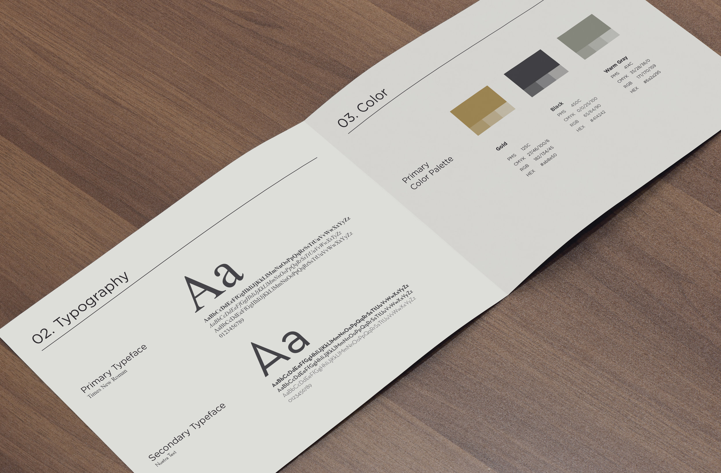
The stationery set was kept to three colors; black, white and gold. This classic pairing of colors set apart Atlas from the many blues and greens found in the industry. It also raised the bar on overall branding and easily set it apart from the competition.
A brief style guide was produced to ensure future collateral was kept on brand. This helped the owner with vendor management and allowed vendors to understand each of the key components of his brand.
The main icon was broken out of the logo and made into a self contained mark that could be used as a shorthand on social media, stationary, stamps, embossing and various future applications.